Morphuse was commissioned to develop a comprehensive brand identity for Find My Practitioner, an innovative online platform that connects individuals with healthcare practitioners across various disciplines worldwide. The branding project encompassed the creation of a distinctive visual identity system including logo design, stationery suite, and digital assets to support their web portal—also built by our team.

Client Background
Find My Practitioner is revolutionizing how people connect with healthcare practitioners by offering a specialized search portal that enables users to find, evaluate, and directly communicate with appropriate medical and wellness professionals globally. The platform serves as a bridge between practitioners seeking to expand their client base and individuals looking for specialized healthcare services, creating a seamless connection that benefits both parties.
Logo Concept and Symbolism
The Find My Practitioner logo was thoughtfully designed to embody the core purpose of the platform while conveying trust, guidance, and wellness:
- The Geometric Icon: The distinctive droplet-shaped emblem features concentric upward-pointing chevrons that symbolize guidance, direction, and the journey toward wellness. This multi-layered design represents the platform’s ability to navigate users through numerous practitioners to find their perfect match.
- Color Psychology: The vibrant teal green palette was deliberately chosen to evoke associations with health, renewal, and tranquility—elements essential to healthcare services. This color also stands out distinctively in the digital landscape where the platform primarily operates.
- Typography Treatment: The wordmark presents “Find My” in bold, substantial navy blue letters, expressing reliability and professionalism, while “PRACTITIONER” appears in the same teal as the icon but with expanded letter spacing, creating a sense of accessibility and openness.
This carefully balanced combination of elements creates an instantly recognizable brand mark that communicates the platform’s purpose at a glance while maintaining a professional appearance essential for a healthcare-adjacent service.
Services Provided
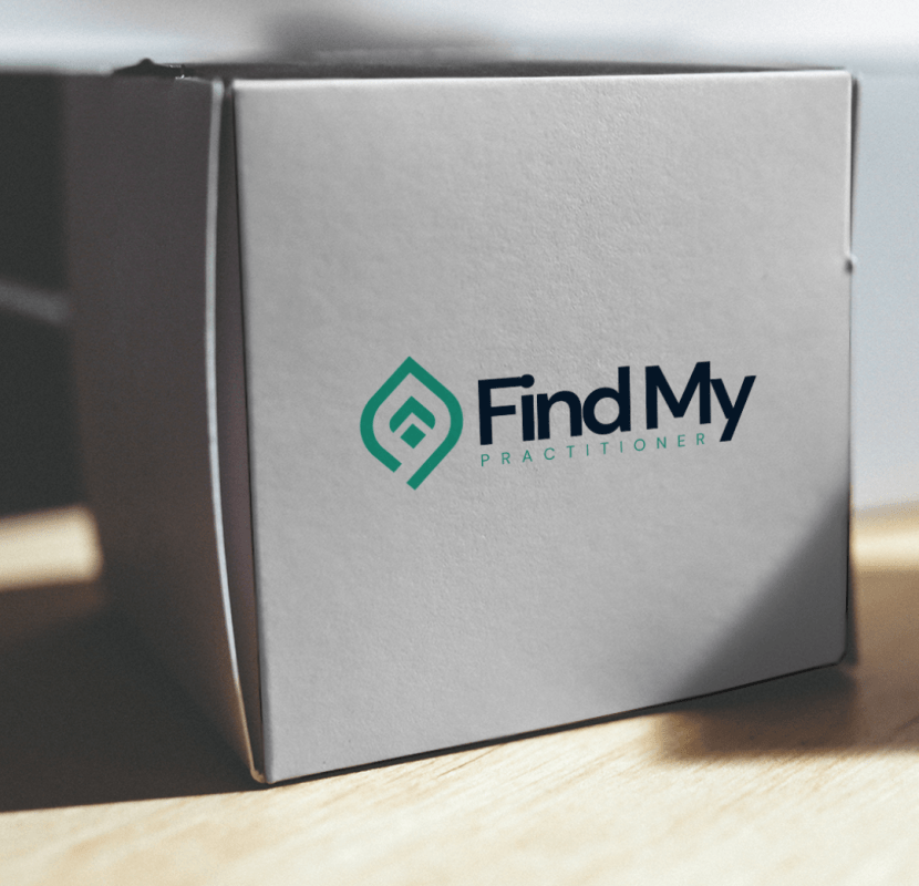
The Find My Practitioner logo features a distinctive droplet-shaped icon with concentric chevrons pointing upward, symbolizing guidance and progress. This geometric mark is paired with a clean, professional wordmark where "Find My" appears in bold navy blue and "PRACTITIONER" in spaced teal letters. We delivered multiple variations including horizontal lockup, vertical arrangement, and icon-only versions for different application contexts. Each variant was provided in color, monochrome, and reverse formats to ensure versatility across all potential use cases.
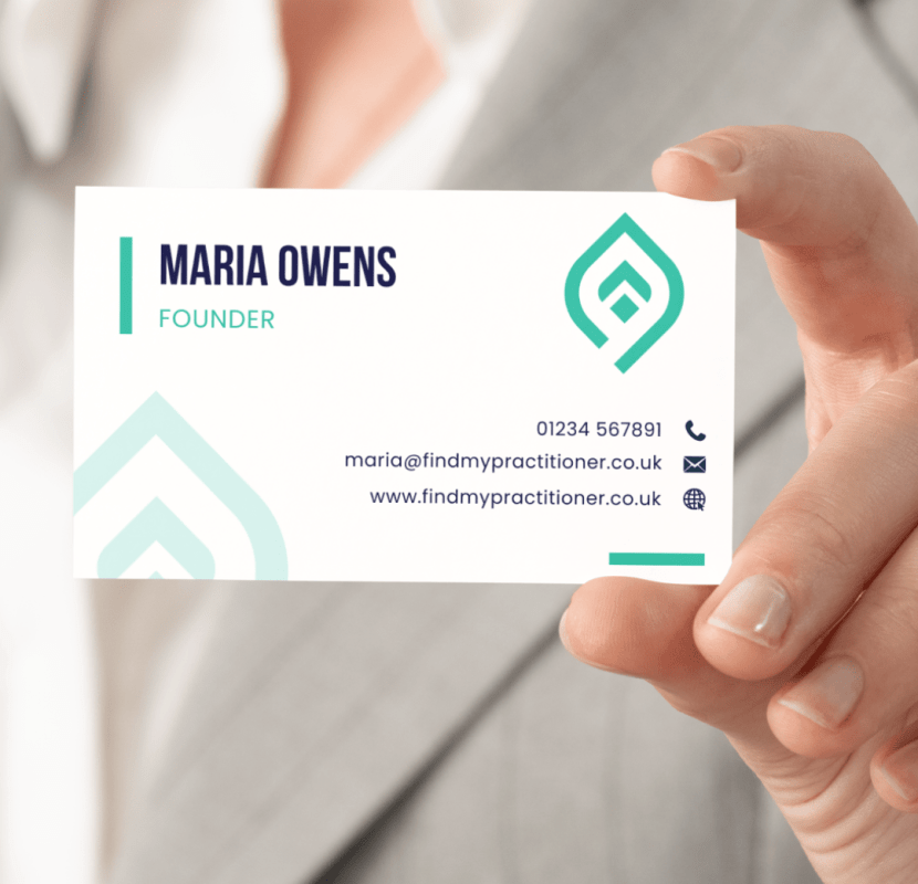
The business card design employs a clean, minimalist approach with the logo prominently featured on a white background on the front face. Contact information is arranged in a clear hierarchy with ample white space for readability. The reverse side features a full teal background with a subtle pattern derived from the logo's chevron elements, creating visual interest while reinforcing brand recognition. The cards were specified for printing on premium stock with a soft-touch laminate finish to create a tactile quality that reflects the brand's professional positioning.
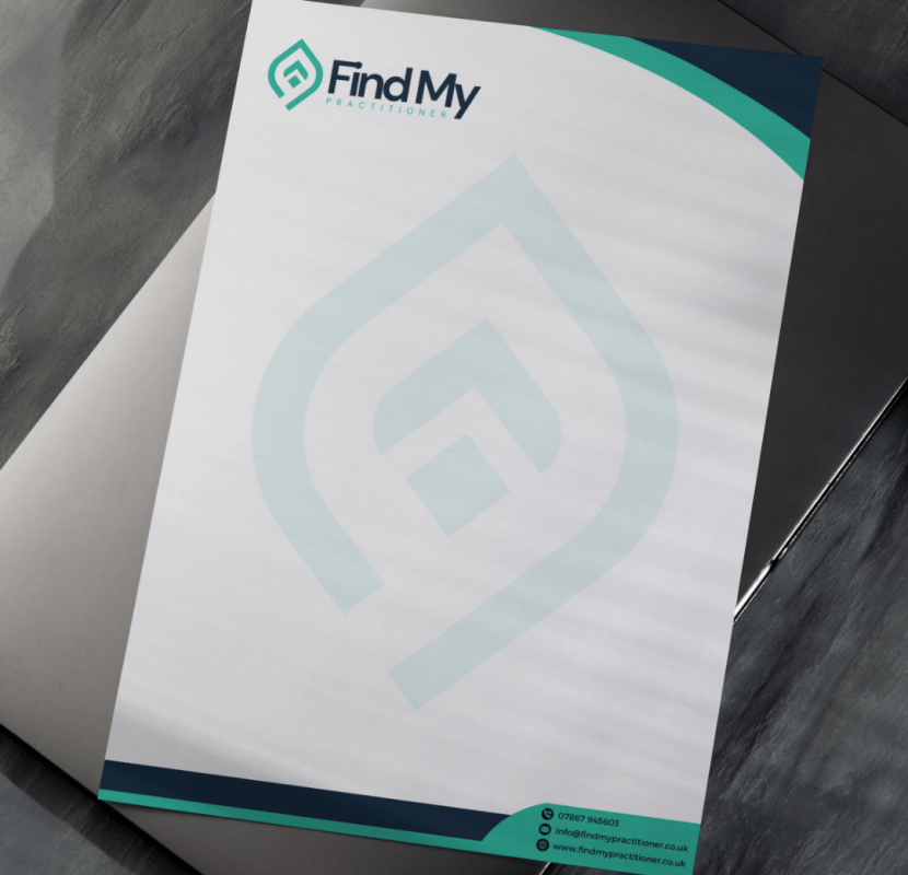
The letterhead design balances professionalism with distinctive brand elements. The main sheet features the Find My Practitioner logo at the top center, with a subtle watermark of the droplet icon integrated into the background. Curved teal elements frame the top and bottom corners of the page, creating visual interest without compromising the document's professional appearance. Contact details are presented at the bottom with dedicated icons for each communication method. The paper was specified as 120gsm premium uncoated stock to ensure quality feel during handling while providing excellent writing properties.
The promotional leaflet employs a tri-fold design that guides potential users through the Find My Practitioner service offering. The cover panel features the logo against a white background with a teal curved element that draws the eye inward. Interior panels use a consistent grid structure to present information about the platform's benefits, features, and testimonials from both practitioners and patients. The final panel includes a clear call-to-action and contact information. The visual hierarchy employs the brand's typography system with navy headings and teal accents to highlight key information points. The leaflet was designed for printing on 250gsm silk stock to provide durability while maintaining color vibrancy.
The website design translates the brand identity into a functional digital platform that prioritizes user experience. The clean, spacious layout employs the brand's color palette with navy blue and teal as accent colors against predominantly white backgrounds. The navigation system is intuitive, providing clear pathways for both practitioners and individuals seeking healthcare services. The practitioner search functionality features advanced filtering options with results presented in card-based layouts that include key information and profile images. The responsive design ensures consistent brand experience across devices, with the logo adapting appropriately for different screen sizes. Custom icons were designed to represent different practitioner specialties, maintaining the geometric style established in the logo design.

Why This Approach Worked?
The healthcare and wellness sector demands a delicate balance between professionalism and approachability. Our design approach for Find My Practitioner achieved this balance.
Symbol with Purpose
Creating a logo that doesn't just look distinctive but communicates the platform's core function of guidance and connection.
Considered Color Psychology
Employing colors that subconsciously reinforce themes of health, trust, and wellness.
Consistent Application
Developing a cohesive system that works seamlessly across both digital and physical touchpoints.
Forward-Thinking Flexibility
Building a visual identity system that can evolve as the platform grows and expands into new service areas.


Brand Guidelines
To ensure consistent application of the new identity, we developed comprehensive brand guidelines covering:
- Logo usage and spacing requirements
- Color specifications (Pantone, CMYK, RGB, and HEX values)
- Typography hierarchy and usage rules
- Imagery style guidance
- Tone of voice recommendations for written communications
- Application examples across various media
Interested in a Similar Project?
Whether you need an e-commerce platform, a corporate site, or a custom web application, we’d be delighted to discuss how we can help you achieve your digital objectives
Contact us today to discuss your project requirements and explore how we can create a digital solution that showcases your products or services as effectively as we did here.


