Morphuse was commissioned to develop a comprehensive suite of seasonal marketing materials for Smart Choice Financial Services, a respected financial advisory firm. Rather than focusing on brand identity development, this project centered on creating high-impact seasonal communications including holiday greeting cards, seasonal promotional flyers, service vouchers, and coordinated social media content that would strengthen client relationships and drive seasonal business opportunities.

Client Background
Smart Choice Financial Services provides personalized financial planning, retirement planning, and insurance solutions to individuals and small businesses. With a client-centered approach and emphasis on building long-term relationships, the firm has established a reputation for trustworthy advice and tailored financial strategies that help clients achieve their financial goals.
Their services span comprehensive financial planning, investment portfolio management, retirement planning, education funding strategies, insurance solutions, and tax-efficient wealth management—all delivered with a personalized approach that considers each client’s unique financial situation and objectives.
Design Strategy and Approach
Our design approach for Smart Choice Financial Services’ seasonal materials was guided by several strategic objectives:
- Relationship Reinforcement: Creating communications that strengthen existing client relationships through personalized, thoughtful messaging that goes beyond transactional interactions
- Consistent Recognition: Maintaining visual consistency across all seasonal materials to reinforce brand recognition while incorporating appropriate seasonal elements
- Professional Warmth: Balancing the firm’s professional financial expertise with seasonal warmth and authenticity to humanize the brand
- Value Communication: Using seasonal touchpoints to subtly reinforce the value of financial planning services while avoiding overtly sales-focused messaging
- Actionable Opportunities: Integrating subtle calls-to-action within seasonal greetings to encourage year-end financial reviews or new year planning sessions
This balanced approach ensured that seasonal communications would feel genuine and appreciated while still supporting business development objectives.
Services Provided
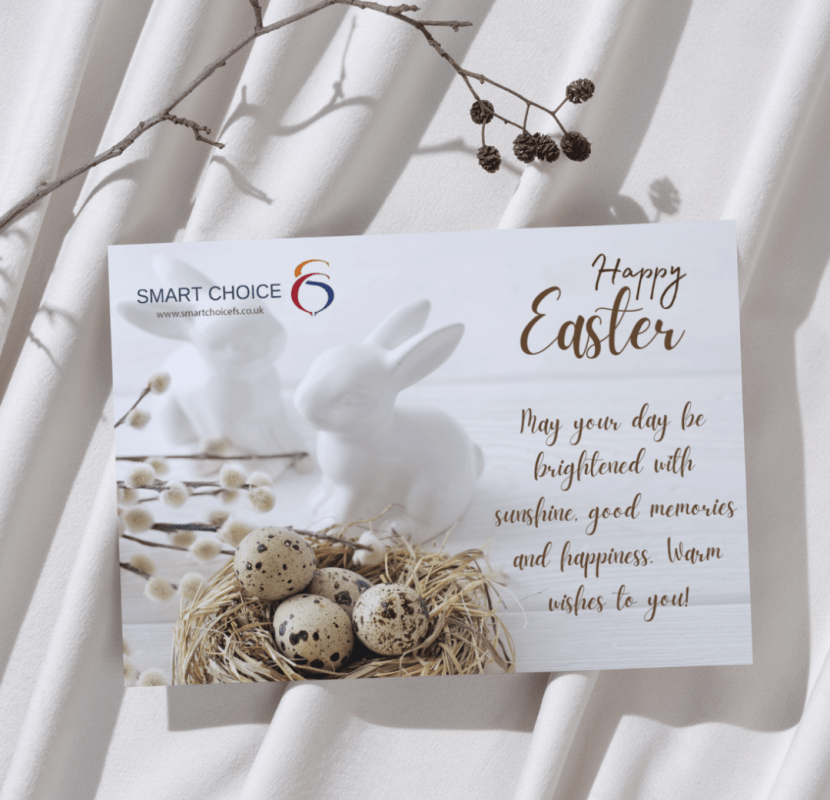
The Easter greeting card showcases an elegant, sophisticated design that balances seasonal warmth with professional branding. The card features a clean white background with the Smart Choice logo prominently displayed in the upper left corner. The centerpiece of the design is a tasteful arrangement of natural elements including a white ceramic bunny figurine, speckled quail eggs in a natural straw nest, and delicate pussy willow branches, creating a refined seasonal aesthetic without explicit religious imagery.
The right side of the card features elegant gold script typography with "Happy Easter" as a prominent headline, followed by a thoughtful message: "May your day be brightened with sunshine, good memories and happiness. Warm wishes to you!" The choice of natural textures and neutral color palette with subtle gold accents conveys both seasonal celebration and professional sophistication, perfectly aligning with a financial service firm's need to appear both warm and credible.
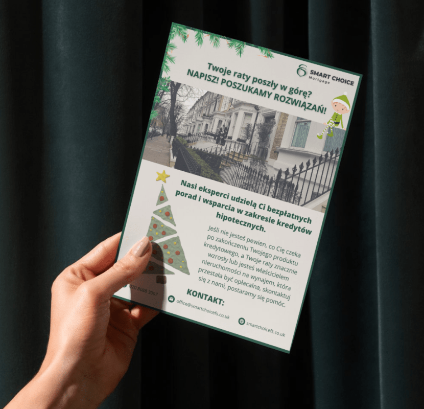
The seasonal promotional flyer is designed with a fresh green color scheme that signals spring renewal while maintaining professional branding elements. The flyer is framed with a green pine needle border and features the Smart Choice Mortgage logo at the top right. The content is presented in Polish, targeting the firm's Polish-speaking clientele with mortgage support services.
The design showcases a professional photograph of elegant townhomes with wrought-iron fencing, directly connecting the content to real estate and mortgage services. Seasonal elements are tastefully incorporated through illustrated Christmas/holiday graphics including a small elf character and a decorated tree at the bottom, suggesting this particular flyer was designed for winter holiday season communications. The contact information is clearly presented at the bottom with the company website and email address, making follow-up actions simple for recipients. The overall design balances professional real estate imagery with subtle seasonal elements that create timely relevance without overwhelming the financial service message.
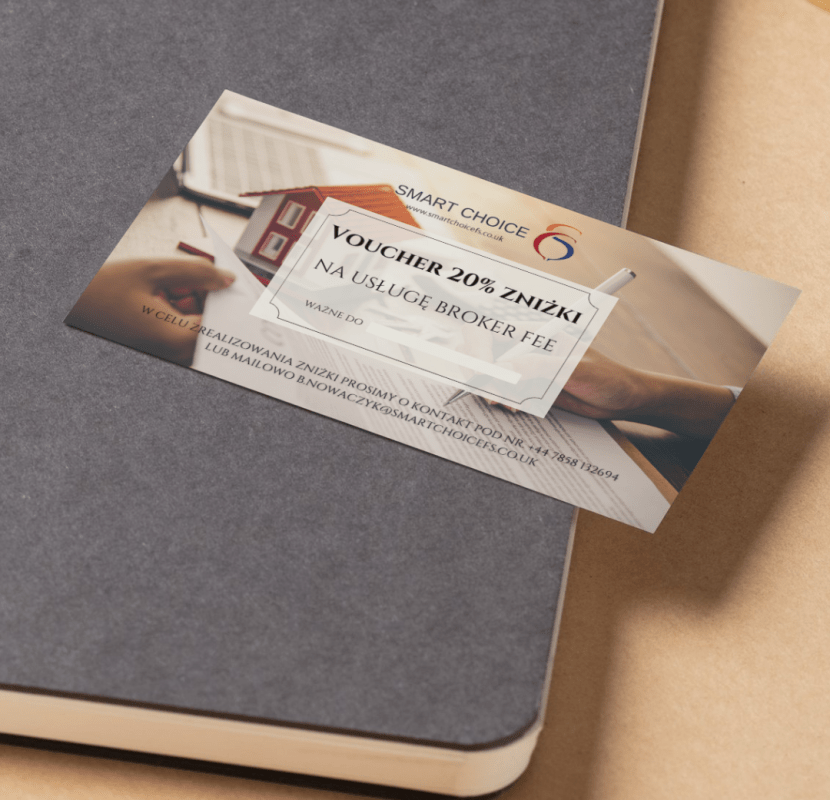
The service voucher employs a premium, business-appropriate design presented as a tangible financial instrument. Set against a professional backdrop of subtle office imagery showing hands working with documents, the voucher prominently displays "VOUCHER 20% ZNIŻKI NA USŁUGĘ BROKER FEE" (20% discount on broker fee services) in bold, clear typography within a defined border that resembles a traditional certificate or monetary instrument.
The Smart Choice logo and website appear at the top, establishing brand authenticity, while redemption instructions in Polish are presented at the bottom with clear contact information including a phone number and email address. The voucher is photographed against a sophisticated gray notebook or portfolio, suggesting professional context and premium presentation. The design effectively communicates financial value through its certificate-like appearance while maintaining the professional branding standards expected from a financial services firm.

Key Success Factors
Several elements contributed to the program’s effectiveness:
Value-First Approach
Focusing on providing genuine value through seasonal financial guidance rather than overt promotion.
Coordinated Visual System
Creating visual consistency across all materials while appropriately incorporating seasonal elements
Thoughtful Personalization
Implementing meaningful personalization that demonstrated genuine client appreciation
Strategic Timing
Carefully planning the sequence and timing of different communications to maintain presence without overwhelming recipients
Quality Production
Investing in premium production values that reflected the firm's professional standards and attention to detail


Brand Guidelines
To ensure consistent application of the new identity, we developed comprehensive brand guidelines covering:
- Logo usage and spacing requirements
- Color specifications (Pantone, CMYK, RGB, and HEX values)
- Typography hierarchy and usage rules
- Imagery style guidance
- Tone of voice recommendations for written communications
- Application examples across various media
Interested in a Similar Project?
Whether you need an e-commerce platform, a corporate site, or a custom web application, we’d be delighted to discuss how we can help you achieve your digital objectives
Contact us today to discuss your project requirements and explore how we can create a digital solution that showcases your products or services as effectively as we did here.


